Caravan packaging
Pannontej 2018
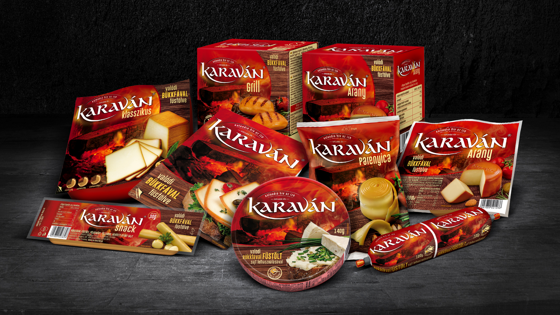
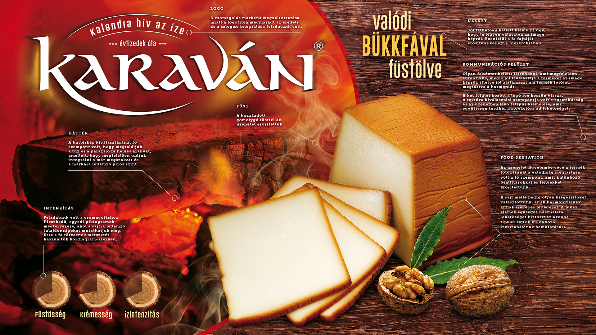
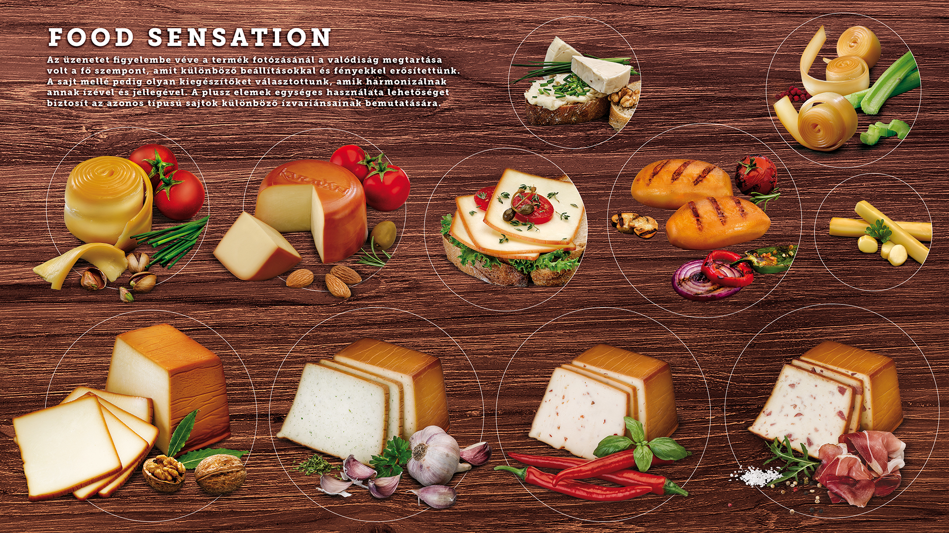
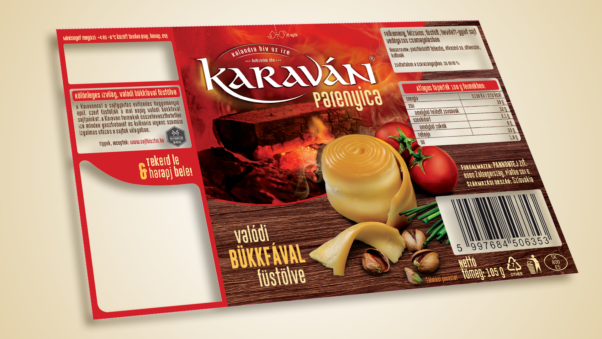
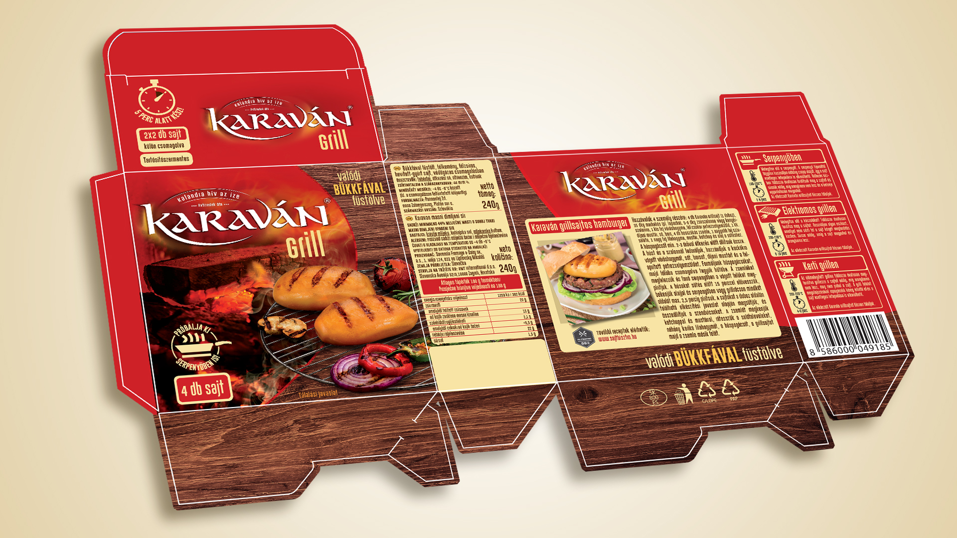
The branding and packaging renewal of the entire Caravan family was intended to showcase the high quality of the products, appealing to new customers. While the red colour scheme, which can be easily decoded by the customers, has been retained in the creative design, the smoking of the cheeses with real beech wood, their richness of flavour and their creamy texture have been emphasized instead of the oriental pattern. Design approaches the world of handicraft and distinguishes the brand from its competitors.
Rustic images represent the taste variants; the smoking method is represented by an emotional, photo-like smouldering flame and a wood pattern, and, in addition, iconic flavour intensity values are included on the packaging. Premium quality is embedded with matte and gloss lacquer highlights.
A total of 13 packages containing product and packaging variants were completed by using a variety of printing techniques such as offset, flexo, digital.


